
The Ultimate Interactive Tailwind CSS Color Palette Reference.
Properly sanitizing your code is just the first step in a clean workflow. To keep your project data organized, check out our JSON Formatter & Validator for debugging your API responses, or head over to our PX to REM Converter to ensure your layouts stay perfectly responsive across all devices.
Let’s be honest: picking a brand color is easy, but building a mathematically balanced design system is hard. Manually hex-calculating every shade from 50 to 950 is a massive time-sink.
I built this Tailwind CSS color palette generator to solve that. Unlike basic tools that just change lightness, this one uses linear RGB interpolation to ensure your colors stay vibrant and proportional. Whether you're a student preparing for university projects or a pro developer, this tool is designed to help you copy and paste your way to a better UI.
Custom Brand Colors vs. The Official Tailwind Scale
There is a specific "feel" to a professional Tailwind CSS color palette. The official team at Tailwind Labs spent hundreds of hours perfecting the balance of their default scales to ensure they are accessible and visually pleasing. However, sometimes the default "Blue-500" just doesn't hit your brand requirements. That’s why I’ve provided both options on this page. You can use the generator above to create a unique identity for your app, or browse the extensive reference library below to find the perfect "Emerald" for a success toast or a "Rose" for an error state.
Traditional media queries create "stepping" effects. A fluid typography generator creates a smooth, linear transition that is more accessible and easier to maintain in modern CSS frameworks like Tailwind.
Start with a hook. "Stop writing manual media queries for every screen size. Our Fluid Hierarchy Engine uses mathematical modular scales to generate production-ready CSS clamp() functions instantly.
Our tool simplifies the math behind responsive design. By choosing a modular scale, the Fluid Typography Generator ensures that your H1, H2, and H3 maintain a mathematical relationship as the screen grows.
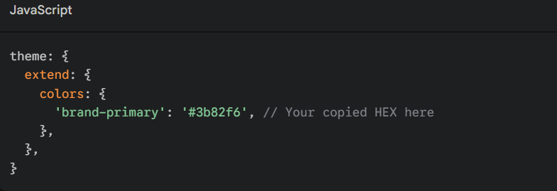
How do I add these colors to my Tailwind config?
Once you use the Tailwind CSS color palette tool to find your HEX codes, simply open your tailwind.config.js file and extend the theme:
Why does my custom 500 shade look "muddy" in other generators?
Most generators use simple HSL shifts, which can desaturate colors as they get darker. This tool uses a linear blend between your base and pure black/white, keeping the RGB ratios proportional.
Is this compatible with Tailwind CSS v4?
Yes! While v4 introduces new ways to handle variables, the underlying HEX values remain the standard for web styling.
What is the best way to pick an accent color for a Tailwind CSS color palette?
A common rule of thumb is the 60-30-10 rule. Use your primary color for 60% of the UI, a neutral from the Tailwind CSS color palette (like Slate or Gray) for 30%, and a high-contrast accent (like Amber or Rose) for the final 10%. This ensures your "Call to Action" buttons truly pop against your layout.
Can I use these HEX codes in CSS-in-JS libraries?
Absolutely. While these are curated for the Tailwind CSS color palette ecosystem, they are standard HEX strings. You can use them in Styled Components, Emotion, or even standard inline CSS. Just remember to define them as constants to keep your codebase DRY (Don't Repeat Yourself).
How does Tailwind handle dark mode with these palettes?
Tailwind doesn't automatically "flip" your colors. Instead, you use the dark: utility. For example, you might use bg-slate-50 for light mode and dark:bg-slate-900 for dark mode. Having the full library reference on this page makes it easy to pick the corresponding "dark" equivalent for any light shade you choose.
In the 2026 landscape of responsive UI and front-end engineering, maintaining a harmonious Tailwind CSS color palette is a critical skill. Our Design Hub is a professional-grade utility engineered to calculate complex linear interpolation layers and bring total mathematical precision to your digital interfaces. Whether you are building a high-authority SaaS interface or auditing a legacy stylesheet for inconsistent branding, this tool provides a high-fidelity environment to generate production-ready color scales safely and effectively.
While static color mapping was a standard practice for older layouts, "proportional-scaling" is now the requirement to ensure visual harmony across the massive spectrum of modern display technologies. The Tailwind CSS color palette generator provides a client-side environment to preview these scales, ensuring you can audit exactly how your primary, secondary, and accent colors harmonize across dynamic components before they interact with your live application logic.

