
Generate production-ready CSS functions for your design system. Use mathematical modular scales or manual overrides to create a perfectly responsive typography hierarchy.
Properly sanitizing your code is just the first step in a clean workflow. To keep your project data organized, check out our JSON Formatter & Validator for debugging your API responses, or head over to our PX to REM Converter to ensure your layouts stay perfectly responsive across all devices.
If you’ve been in the frontend game for more than a minute, you know the "Breakpoint Trap." You start with a mobile font size, add a media query for tablets, another for small laptops, and one more for ultrawide monitors. Before you know it, 30% of your CSS is just managing "jumps" in font sizes.
It’s brittle, it’s a nightmare to maintain, and frankly, it looks amateur.
In 2026, we don't "jump" anymore. We flow. I built this Fluid Typography Generator to automate the linear interpolation math required to make your headers scale perfectly from a 320px viewport up to 1920px and beyond without a single @media rule.
The Problem with Static Sizing
Traditional typography is static. But the web is fluid. When you use static breakpoints, you’re essentially guessing where the user’s "ideal" reading experience lies. Between those breakpoints, your type is either slightly too big or slightly too small.By using the CSS clamp() function, we treat font size as a dynamic range. We define a floor (the minimum size for mobile), a ceiling (the maximum size for desktop), and a Slope (the mathematical "preferred" rate of growth).
How the Engine Handles the Math
I’ve seen a lot of calculators that just spit out a random vw value. That’s a mistake. If your vw value is too aggressive, your text will be unreadable on 4K screens. If it’s too shallow, it won't scale at all.
Our Fluid Typography Generator uses a Linear Interpolation formula ($y = mx + b$):
The Slope: We calculate the rate of change between your min and max sizes relative to your viewport range.
The Intercept: We determine the precise offset required so that the scaling starts exactly at your vMin and caps out at your vMax.
Traditional media queries create "stepping" effects. A fluid typography generator creates a smooth, linear transition that is more accessible and easier to maintain in modern CSS frameworks like Tailwind.
Start with a hook. "Stop writing manual media queries for every screen size. Our Fluid Hierarchy Engine uses mathematical modular scales to generate production-ready CSS clamp() functions instantly.
Our tool simplifies the math behind responsive design. By choosing a modular scale, the Fluid Typography Generator ensures that your H1, H2, and H3 maintain a mathematical relationship as the screen grows.
What is a Fluid Typography Generator?
A Fluid Typography Generator is a tool that calculates a CSS clamp() function to allow font sizes to scale smoothly between a minimum and maximum viewport width. Unlike traditional media queries that "jump" at specific breakpoints, a fluid scale ensures your text always fits the screen perfectly.
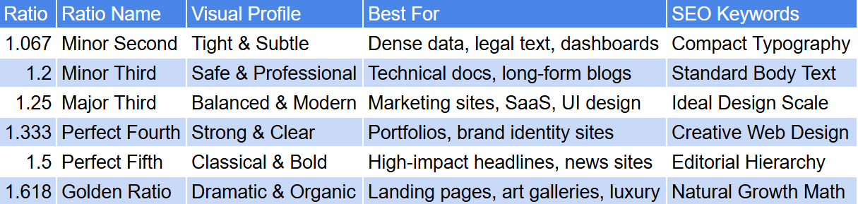
Why use a Modular Scale for typography?
A modular scale uses a consistent mathematical ratio (like the Golden Ratio or Major Third) to determine the size of your headings. Using this within a Fluid Typography Generator ensures visual harmony across your design system, as every heading level is proportionally related to the base body text.
Is the CSS clamp() function supported in all browsers?
Yes. As of 2026, the clamp() function is supported by all modern evergreen browsers, including Chrome, Firefox, Safari, and Edge. It is the industry-standard method for implementing responsive design without bloated CSS.
How do I use the generated code in my project?
Simply use our Fluid Typography Generator to set your desired scale, then click "Copy All CSS." You can paste this code into your global stylesheet or use the specific clamp() values within your Tailwind CSS configuration or CSS variables.
Does fluid typography help with SEO and Accessibility?
Absolutely. By using rem units in your Fluid Typography Generator, you ensure that your site remains accessible to users who change their browser's default font size. Google also favors sites that provide a seamless mobile experience, which fluid scaling provides.
In the 2026 landscape of responsive design and front-end engineering, maintaining a harmonious typographic scale is a critical skill. Our Fluid Typography Generator is a professional-grade utility engineered to calculate complex linear interpolation layers and bring total mathematical precision to your design systems. Whether you are building a high-authority SaaS interface for varied viewports or auditing a legacy stylesheet for inconsistent scaling, this tool provides a high-fidelity environment to generate production-ready CSS clamp() functions safely and effectively.
While static sizing was a standard practice for older layouts, "fluid-scaling" is now the requirement to ensure readability across the massive spectrum of modern device resolutions without relying on brittle media queries. The Fluid Typography Generator provides a high-fidelity, client-side environment to preview these scales, ensuring you can audit exactly how your H1, H2, and H3 headers behave across viewports before they interact with your live application logic.

